
Hey Charge Visual Identity Design
Over the years power bank sharing has been a popular lifestyle service within the Asian market place. Now with a European presence and strong possibilities to break through into a very competitive market, building a brand tailored for the European market felt very compelling and exciting for me to work on. The main challenge in the briefing was how to relay the service qualities and promise from an Asian centric targeted product to a European one. The two markets are very different culturally but the service promise stays the same.
The Art direction starting by understanding the target user group, teenagers and young adults and adults, creating moodboard of the trending digital services, sharing services, defining look and feel, together with the client, we came up with the core value of the “Hey Charge”: Chill, Simple, Sustainable.

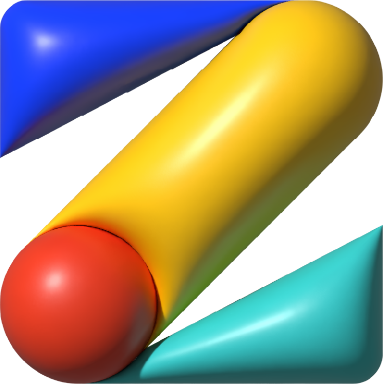
We crafted the logo with minimalism and simplicity, with the bright, festive and fine-tuned colors it brings a digital, fresh, friendly, playful yet professional look and feel. the shape portrays a lightning bolt, representing battery, charging and electricity, which is easy to identify the purpose of the service.


We applied meaning to the 3 primary colors: they represent Low battery, Charging and Fully charged, which are being used in the logo, symbolizing the charging process. We created nuances for other case usages based on the primary colors.
Icons look and feel with color nuances.

For the typeface selection we picked the san serif font “Metropolis”, contemporary and geometrically treated, can very well complement the graphic.


![poster-park].jpg](https://images.squarespace-cdn.com/content/v1/5e314817230a2747f5b0cef2/1582210931508-6YT7XF1AKFY2AFEZLCNM/poster-park%5D.jpg)


For the social communication, Brand colors can be used accordingly to the scenario, the communication system can be applied across all channels and maintaining consistency.

Hey Charge App design is coming soon
#art direction #VI #graphic-design #branding #visual-design #motion-graphic
Service concept, Art Direction, UI & UX, graphic design production: Ziqi Hu