
Rubik Art and Education Centre Visual Identity Design
Rubik Art and Education Center is a private organization specializing in teaching fine art and music for children. Inspired by Rubik’s cube, the visual language interpreted the idea into something colorful, dynamic and reconstructable, to build the visual tonality to symbolize creativity, diversity, and individuality.

Rubik’s Cube as a starting point, we use the isometric angle view to braw the baselines, based on that we crafted the shape that symbolizing “plus” intersect with each other, which is an important metaphor for education topic. All the colors are carefully selected from the triad color scheme to deliver the message of equality and diversity.

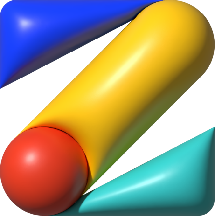
The visual system that generated from the logo is extremely colorful and limitless, different shapes represent the different possibilities, or they can be used as specific objects or signs, like a Chair or Music. Just like the Rubik’s cube, although the rules are different, we courage all possibilities here, we wanted to create a place for children to be as creative as they can.

Logo tiled pattern


#art-direction #graphic-design #branding #visual design
Art Direction, graphic design production: Ziqi Hu